Case Study - Yello App

A brand new app to bring Yello into the app-first era
Yello App Impression
Client
Yello Strom GmbH
Area
Product Experience
Release date
May 2023
Platforms
iOS & Android

Overview

For more than two decades, Yello has reliably supplied around 900,000 people in Germany with gas and electricity. From the very beginning, the energy provider from Cologne relied on a web-based service. Yello's mission: to make energy consumption transparent and simple for their customers.

Facing pressure from new competitors and a rapidly changing digital environment, Yello continually strives to provide top-level customer experience. The company turned to DUMBO to help it transition its leadership into the app-first era. And we gladly took on the challenge.

WHAT WE DID

  • Design strategy & vision for transformation
  • Detailed design of first app and high-fidelity prototyping
  • Creative direction and quality assurance
  • Cross-functional collaboration with multiple teams
  • Setting up an app design system
  • Translation of brand language for mobile
  • Training for Yello designers during handoff

We want to inspire our customers with excellent digital services. With DUMBO, we have found a partner who stands by our side with the highest quality standards, excellence in design and full commitment.

Henrik Ehrhardt
Product Owner, Yello
A grid of multiple round electric meters mounted on a blue wall, with various readings visible.

Customer retention in a faceless market

33 %

increase in German energy consumption by 2030 is forecasted, driven by an increase in electric vehicles and heating.

81 %

of consumers want their energy provider to play an active role in enhancing their service journey.

We worked with Yello to transform the passive relationship customers have with their energy supplier into an ongoing dialog. This is because the contact that customers generally have with their energy provider is limited to the annual statement – which, in the worst case, lands in their lap with an unexpected additional payment that increases their monthly bills. Otherwise, customers rarely hear anything from their provider.

Recognizing that more positive contact builds customer loyalty, Yello turned to DUMBO to lay the foundation for a mobile-first experience and design a new app that becomes the primary touchpoint for all customers. Guided by insights from analysing customer behaviour and market trends, we aimed to foster customer relationships through the app by creating engagement and offering increased transparency. 

Complementing the web format, an app presents new opportunities to offer a closer and more personal touchpoint. We aimed to leverage newer technologies to enhance the entire customer journey and create new habits throughout the customer’s lifetime. 

Highlights

01 The whole energy budget at a glance How we help to monitor the energy budget.
02 New inspiration for a playful approach to energy The balance between cost and consumption.
03 Fast solutions through efficient self-service How we provide the right help at the right time.
04 Full of good energy! Yello’s Branded Interaction The Yello brand in interactions.
05 United in diversity through common UX patterns Interactions that shape the experience.
Three smartphone screens displaying an energy tracking app. The first screen shows positive feedback on reduced energy consumption with a downward trend graph. The second indicates a warning about a potential additional payment with a gauge. The third confirms an increase in consumption with a bar graph, inviting users to view details.

The whole energy budget at a glance

40 %

of German consumers do not know how much electricity their household consumes yearly.

Given the increasing complexity of energy use, it is more important than ever to have a transparent overview of your energy consumption. That’s why users get full transparency over their consumption and gas or electricity costs – to promote sustainable living and economical use of energy.

New inspiration for a playful approach to energy

69 %

of German consumers want more precise and easily accessible information about their overall electricity consumption.

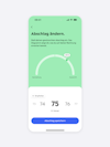
The most critical moment is when the customer receives their year-end invoice. If it is higher or lower than expected, this can cause the customer annoyance and stress. It is therefore crucial to prevent this, and show users in a playful way how to bring their consumption and costs into balance, and what benefits they can reap.

This way, each customer gets a timely heads-up of what to expect on their invoice: an additional payment, or a positive credit.

A mobile application interface displaying an option to change the monthly installment amount. The screen features a green background and a semicircular gauge to indicate the installment level. The current selected amount is 75 euros per month, with a button to save the new payment adjustment.

Fast solutions through efficient self-service

Yello particularly good at recognising the intent of their customers, in order to tailor their offerings to individual needs. To reduce the cost to serve, we have taken self-service to a new level.

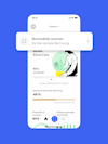
By leveraging the existing capabilities, we empower users to find the right help in the right context and at the right time, so that they can resolve contract-related issues quickly and independently.

A screenshot of an energy service app's home screen with a blue background, offering a meter scanning feature for upcoming billing. It displays an illustration of a person with a plant, indicating eco-friendly service, alongside details such as '90 € per month' and 'Last meter reading is 5 days old'. There's a progress bar showing 48% consumption since the last billing and an anticipated credit of 89 €.
A smartphone screen displaying a notification for a new energy bill. The interface is clean and user-friendly with an illustration of a person and a plant, symbolizing eco-friendly energy usage. Two options are presented: 'View now' and 'Do this later' for user convenience."

Full of good energy! Yello’s Branded Interaction

Yello is bursting with good energy! As an energy provider, Yello has a distinctive brand voice that is direct, easy to understand, and sees customers eye-to-eye.
DUMBO reinterpreted these principles in the app to create a streamlined, user-centric app flow. In doing so, we placed special emphasis on micro-interactions and motion to create delightful moments, and convey speed and lightness.

United in diversity through common UX patterns

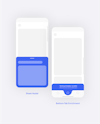
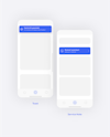
The Yello app needed to explore new interaction patterns that could be scaled to a variety of use cases. This way, various different interfaces can contribute to a consistent overall user experience while maintaining their own voice and identity.

Minimalist mobile app design displaying a 'Sheet Modal' and a 'Bottom-Tab Enrichment' with a prompt to update consumption data in German.
Stylized smartphone interface showcasing a 'Toast' notification with the message 'Nachricht gesendet' and a 'Service Note' scheduling a callback for Wednesday at 15:40.
Two smartphone interfaces showing a 'Ceiling Banner' with an error message and 'Context Tiles' suggesting the automation of payments in German.

Working with DUMBO is always intense, challenging, on equal footing and, above all, rewarding. You dig deep into each topics, build a shared understanding of the real problems, identify possibilities and develop suitable solutions. Technically and methodologically precise, yet able to think outside the box - that’s what makes it fun to redesign digital products and services. Great team, great people, great results!

Christina Moritz
Customer Research Manager, Yello

We would like to thank the Yello team, as well as the development team, for the fantastic cooperation we experienced during this project.

Our hopes shine bright for the future of energy as we continue to work together on the long-term vision for the Yello App service experience.

Our insights straight to your inbox